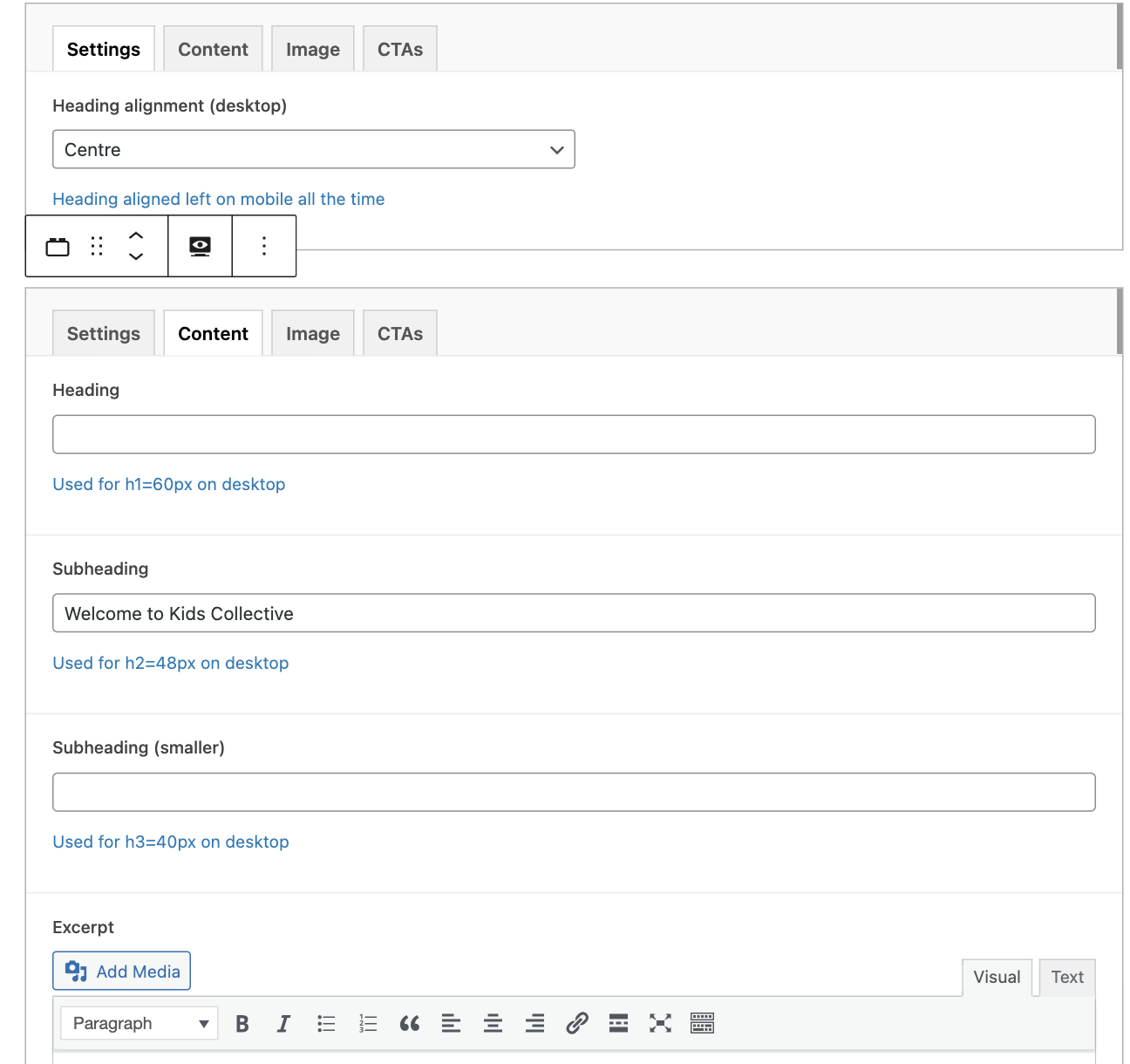
Text Block
The Text Block is a versatile content block designed to display a heading, a subheading, a paragraph of text, and optional call-to-action buttons. It's a fundamental block for presenting textual content in a clear and organized way. This block is highly adaptable and can be used to create various types of content sections.
Block Functionality
- Clear Messaging: The heading, subheading, and excerpt fields allow you to convey a clear and concise message.
- Call-to-Action: The call-to-action buttons provide clear paths for users to take action.
- Customizable Layout: The heading alignment option allows you to customize the layout.
- WYSIWYG Editor: The excerpt field uses a WYSIWYG editor, allowing for basic text formatting.
- Multiple Buttons: You can add multiple call-to-action buttons to guide users to different actions.
- Background Color: The block supports background color.
- Versatile: The block can be used in many different ways.
Content Editor Fields
Heading
- Description: The main heading for the text block. This should be a concise and impactful title that grabs the user's attention.
- Usage: Enter the main heading text here. This will be displayed as an
<h3>tag on the front end. - Requirement: Optional. If left empty, no heading will be displayed.
Subheading
- Description: A subheading that provides additional context or detail.
- Usage: Enter the subheading text here. This will be displayed as an
<h3>tag on the front end. - Requirement: Optional. If left empty, no subheading will be displayed.
Excerpt
- Description: The main text content of the block.
- Usage: Enter the text content here. You can use basic formatting like bold, italics, and links.
- Requirement: Optional. If left empty, no excerpt will be displayed.
Call-to-Action Buttons (CTAs)
- Description: This field allows you to add multiple call-to-action buttons to the text block.
- Usage: You can add multiple buttons, each with its own link, text, and style.
- Requirement: Optional. If no buttons are added, no buttons will be displayed.
- Sub-fields:
- URL:
- Description: The link where the button should take the user.
- Usage: Enter the full URL (e.g.,
https://www.example.com/page). - Requirement: Optional. If left empty, the button will not be displayed.
- Title:
- Description: The text displayed on the button.
- Usage: Enter the button text (e.g., "Learn More", "Contact Us").
- Requirement: Optional. If left empty, the button will not be displayed.
- Style:
- Description: Choose the style of the call-to-action button.
- Usage: Select from available styles (e.g., "Plain", "Outline", "Text").
- Requirement: Optional. If left empty, the default style will be applied.
- Color:
- Description: Choose the color of the call-to-action button.
- Usage: Select from available colors (e.g., "Primary", "Secondary", "Tertiary").
- Requirement: Optional. If left empty, the default color will be applied.
- Hover Effect:
- Description: Choose the hover effect of the call-to-action button.
- Usage: Select from available hover effects (e.g., "White Background", "Clear").
- Requirement: Optional. If left empty, the default hover effect will be applied.
- URL:
Settings
Heading Alignment (desktop)
- Description: Controls the horizontal alignment of the heading on desktop screens.
- Usage: Choose from "Left", "Centre", or "Right".
- Note: On mobile devices, the heading will always be aligned to the left.
- Requirement: Optional. If left empty, the default alignment will be applied (centre).
Customization
You can further personalize the Text Block by:
- Adjusting the Heading, Subheading, and Excerpt: Change the heading, subheading, and excerpt to match your content.
- Adding Multiple Call-to-Action Buttons: Add multiple call-to-action buttons to guide users to specific pages or actions.
- Customizing Button Style, Color and Hover Effect: Select a style, color and hover effect for each call-to-action button.
- Adjusting Heading Alignment: Use the heading alignment option to change the layout.
- Customizing the Background Color: Use the background color option to change the background color.
Benefits
- Clear Communication: The block allows you to present a clear message with a heading, subheading, and text content.
- User Engagement: The call-to-action buttons encourage user interaction.
- Customizable: The block's layout and appearance can be customized to match your website's design.
- Versatile: The block can be used in many different ways.
- Multiple CTAs: The block can display multiple call-to-action buttons.
- Background Color: The block supports background color.
Conclusion
The Text Block is a versatile tool for creating engaging text sections on your website. It's customizable, easy to use, and effectively highlights key information and calls to action. Its adaptability makes it suitable for a wide range of content needs.
Example Preview:

Editor Preview:

