Cards Block
The Cards Block is a versatile tool for showcasing multiple pieces of information in a visually appealing and organized manner. It offers the flexibility to display cards in either a static grid layout or a dynamic slider, making it adaptable to various content presentation needs.
Content Editor Fields
Card Type
- Description: Determines how the cards will be displayed.
- Options:
- Grid: Displays cards in a static grid layout.
- Slider: Presents cards in a horizontal slider.
- Usage: Choose the layout that best suits the number of cards and the desired user experience.
Card Content
- Icon:
- Description: An optional image displayed at the top of the card.
- Usage: Upload an image that visually represents the card's content.
- Requirement: Optional.
- Title:
- Description: A concise heading for the card.
- Usage: Enter a brief title that summarizes the card's main topic.
- Requirement: Optional.
- Description:
- Description: A brief text description providing more details about the card.
- Usage: Enter a short description that elaborates on the card's title.
- Requirement: Optional.
Call-to-Action (CTA) Options
- CTA Display:
- Description: Determines how the card's link will be handled.
- Options:
- On CTAs: Displays individual CTA buttons within the card.
- Off CTAs: Makes the entire card clickable, linking to a specified URL.
- Usage: Choose whether to use individual buttons or make the whole card a link.
- CTA Customization (per CTA):
- URL:
- Description: The link the CTA will direct to.
- Usage: Enter the full URL (e.g.,
https://www.example.com/page). - Requirement: Optional. If left empty, the button will not be displayed.
- Title:
- Description: The text displayed on the CTA button.
- Usage: Enter the button text (e.g., "Learn More", "Read More").
- Requirement: Optional. If left empty, the button will not be displayed.
- Style:
- Description: Choose the style of the call-to-action button.
- Usage: Select from available styles (e.g., "Plain", "Outline", "Text").
- Requirement: Optional. If left empty, the default style will be applied.
- Color:
- Description: Choose the color of the call-to-action button.
- Usage: Select from available colors (e.g., "Primary", "Secondary", "Tertiary").
- Requirement: Optional. If left empty, the default color will be applied.
- Hover Effect:
- Description: Choose the hover effect of the call-to-action button.
- Usage: Select from available hover effects (e.g., "Clear", "White Background").
- Requirement: Optional. If left empty, the default hover effect will be applied.
- URL:
Slider Settings (if Card Type is Slider)
- Slider Type:
- Description: Defines the slider's behavior.
- Usage: Select the desired slider type (e.g., "slide").
- Slider Speed:
- Description: Controls the speed of the slider's transitions.
- Usage: Adjust the speed to match the content and desired user experience.
- Slider Autoplay:
- Description: Enables or disables automatic sliding.
- Usage: Toggle on or off based on whether you want the slider to move automatically.
- Slider Arrows:
- Description: Shows or hides navigation arrows.
- Usage: Toggle on or off based on whether you want to display arrows.
- Slider Dots:
- Description: Shows or hides navigation dots.
- Usage: Toggle on or off based on whether you want to display dots.
- Number of Slides:
- Description: Defines the number of slides to display at once.
- Usage: Set the number of slides visible in the slider at any given time.
- Custom Arrows:
- Description: Custom SVG arrows are used for navigation.
- Usage: The custom arrows are included using
include($svg_path);
Styling Options
- Box Shadow:
- Description: Adds a box shadow effect to the cards.
- Usage: Toggle on or off to add visual depth to the cards.
- Custom CSS:
- Description: Allows injecting custom CSS classes into the CTAs.
- Usage: Add custom CSS classes for more specific styling.
Disposition (Layout Options):
The Cards Block offers two main layout options, determined by the "Card Type" setting.
Grid
- Description: Cards are displayed in a static grid layout.
- Usage: Ideal for presenting a small to medium number of cards in a clear and organized manner.
Slider
- Description: Cards are displayed in a horizontal slider, allowing users to navigate through them.
- Usage: Best for showcasing a larger number of cards without taking up too much vertical space on the page.
Example Usage:
Steps:
- Add the block: Insert the Cards Block into your page or post.
- Choose settings:
- Card Type: Grid
- CTA Display: On CTAs
- Box Shadow: On
- Set the content:
- Card 1:
- Icon: Upload an icon.
- Title: "Card 1 Title"
- Description: "This is the description for card 1."
- CTA 1:
- Title: "Learn More"
- URL: "#"
- Style: Plain
- Color: Primary
- Hover Effect: Clear
- Card 2:
- Icon: Upload an icon.
- Title: "Card 2 Title"
- Description: "This is the description for card 2."
- CTA 1:
- Title: "Read More"
- URL: "#"
- Style: Outline
- Color: Secondary
- Hover Effect: White Background
- Card 1:
- Save the Block: Your Cards block is now ready for display!
Result:
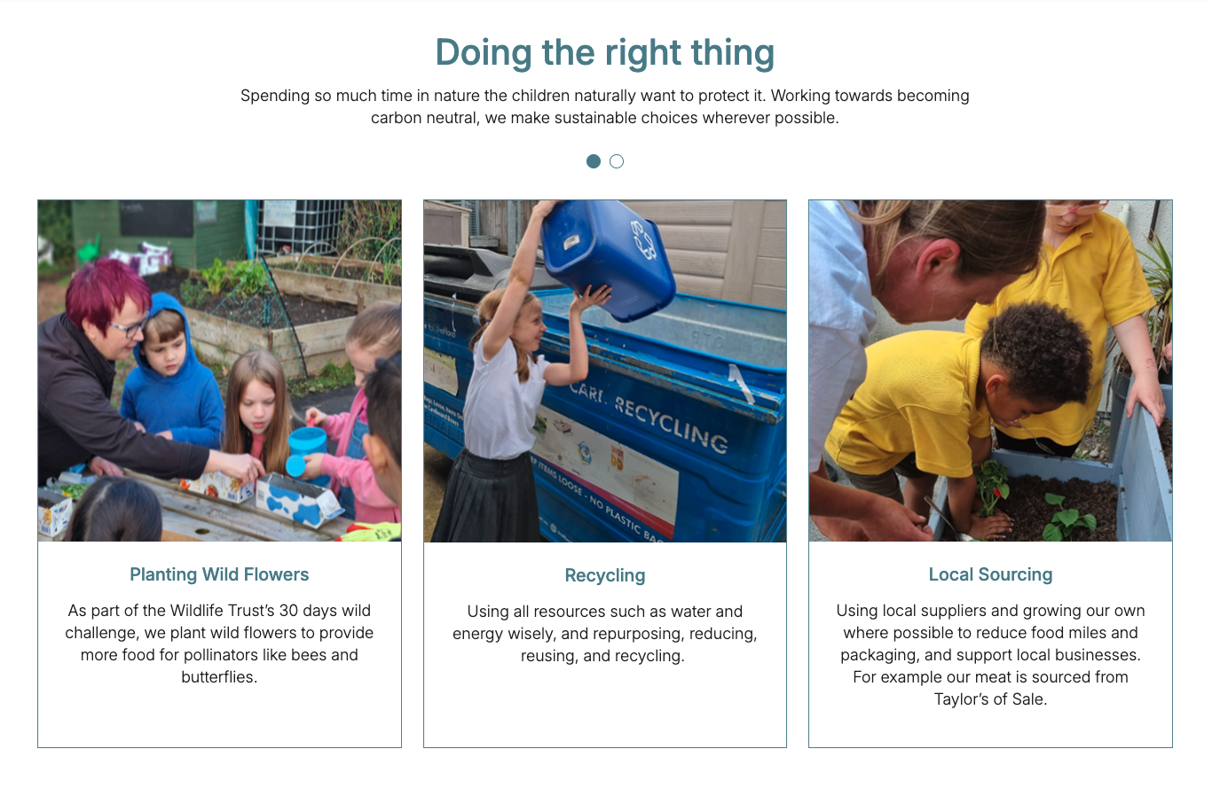
When properly configured, the Cards Block will render a visually appealing section on your webpage. For example, if you choose the "Grid" layout, the cards will be displayed in a grid format, each with its icon, title, description, and CTA button. If you choose the "Slider" layout, the cards will be displayed in a horizontal slider, allowing users to navigate through them.
Preview with image:
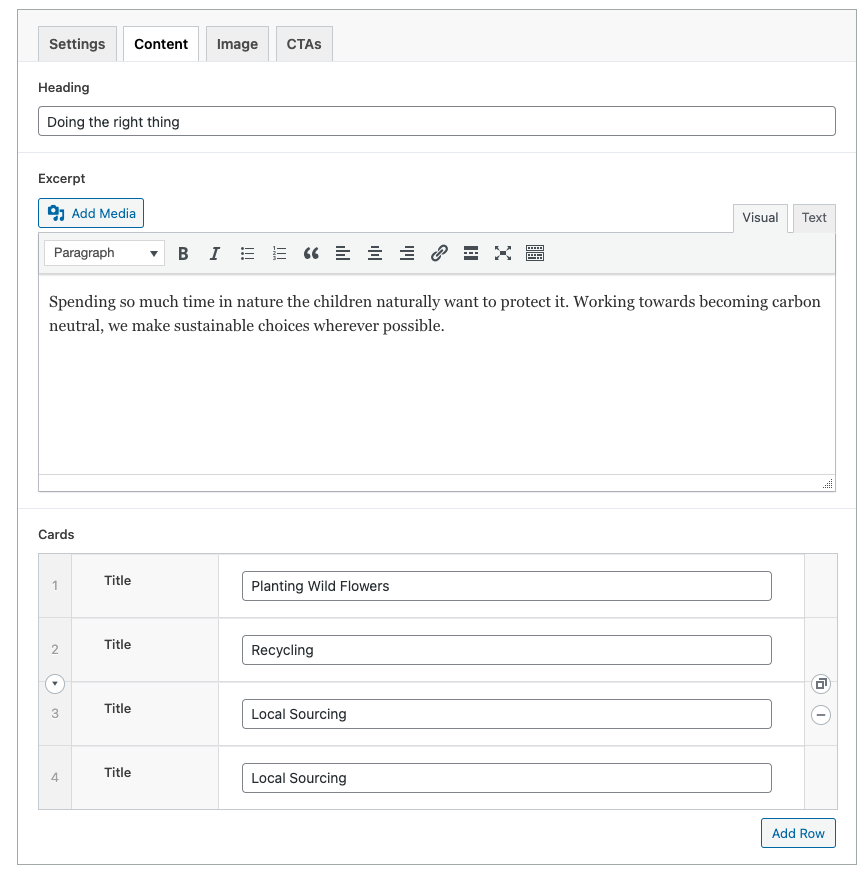
Editor preview:

Customization:
You can further personalize the Cards Block by:
- Adjusting Content: Change the icons, titles, and descriptions to match your content.
- CTA Strategy: Decide whether to use individual CTA buttons or make the entire card clickable.
- Layout Choice: Choose between a grid or slider based on the number of cards and the desired user experience.
- Slider Settings: Adjust slider settings (speed, autoplay, arrows, dots) to match the content and desired user interaction.
- Visual Consistency: Ensure the card design (icons, colors, fonts) aligns with the overall website design.
- Accessibility: Ensure that the icons have proper alt text for screen readers. Ensure that the CTAs have clear and descriptive text. Test the slider navigation with keyboard controls.
- Responsive Design: Test the cards block on different screen sizes to ensure it displays correctly on mobile, tablet, and desktop.
Benefits:
- Versatile Layouts: Offers both grid and slider layouts to suit different content needs.
- Clear Information: Presents information in a structured and easy-to-digest format.
- User Engagement: Encourages user interaction through CTAs and slider navigation.
- Customizable: Highly customizable in terms of content, layout, and styling.
- Dynamic Content: The template uses PHP to dynamically generate the HTML for the cards.
- CTA Handling: Conditional logic determines whether to wrap the entire card in a link or to display individual CTA buttons.
- Slider settings: The slider settings are dynamically added as classes to the slider container.
- Custom Arrows: The custom arrows are included using
include($svg_path);
Conclusion:
The Cards Block is a powerful and versatile tool for building engaging sections on your website. It provides flexibility in terms of layout, styling, and user interaction, making it an excellent choice for any content that combines text, images, and calls to action in a structured, visually appealing way.

